As a self-proclaimed home decor enthusiast, I’ve seen it all – from those dramatic, full-scale room transformations that could make even the most stalwart of design aficionados swoon, to the more subtle, budget-friendly refreshers that can breathe new life into a tired living space. And you know what? I absolutely adore them both.
There’s just something so satisfying about taking a drab, lackluster room and turning it into a stylish, personality-filled oasis. But let’s be real – not all of us have the kind of budget that would make Lisa Vanderpump’s closet quiver in envy. Sometimes, the sweet spot lies in using what you already have and sprinkling in a few strategic new pieces to revive the entire space.
That’s exactly the approach I took when my best friend, Neda, asked for help with her living room. The poor thing was starting with a bare-bones space, and she was feeling a little lost on how to make it feel warm, inviting, and, well, lived-in. But with a bit of creativity, some clever styling, and a few budget-friendly finds, we were able to transform her once-bland living room into a cozy, functional haven she could truly call her own.
Assessing the Existing Space
When I first stepped into Neda’s living room, I couldn’t help but notice the stark, almost clinical vibe of the space. The walls were a plain, neutral tone, and the furniture was sparse and uninviting. It felt more like a waiting room than a place where you’d want to kick back and relax.
But, as they say, every cloud has a silver lining. The blank canvas presented an opportunity to really make this space shine. We started by taking a close look at the room’s layout and identifying the key functional needs. Neda wanted a space that was cozy and welcoming, with ample seating for her family and friends, as well as a designated area for her to curl up with a good book or her favorite home renovation project.
Crafting a Cohesive Design Plan
With the functional requirements in mind, we set out to create a cohesive design plan that would breathe life into the room. I encouraged Neda to start with a neutral color palette as the foundation, allowing us to layer in pops of color and texture through carefully selected accessories and soft furnishings.
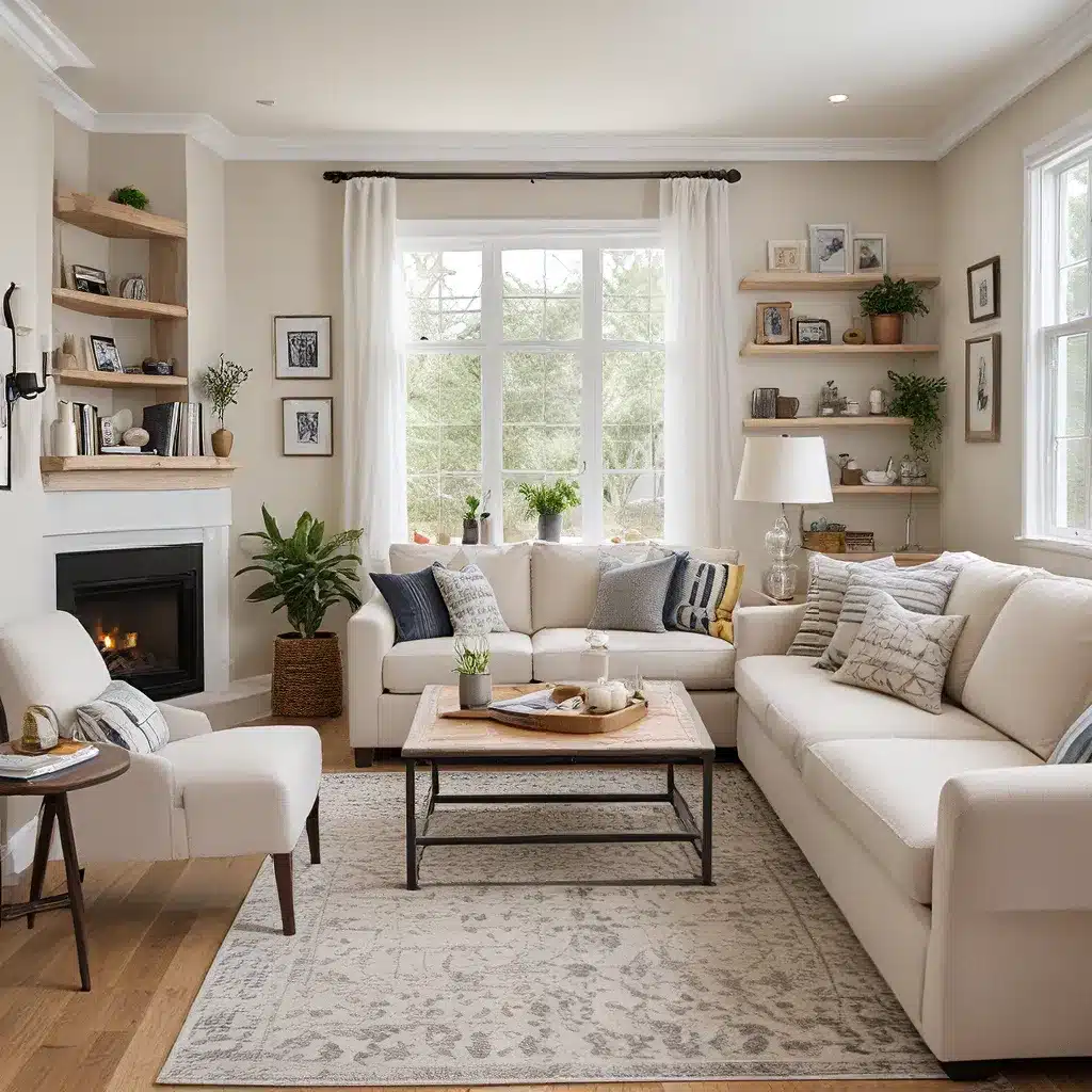
One of the first things we did was invest in a plush, oversized sofa that would serve as the room’s central gathering point. We chose a neutral, earthy tone that would complement the existing wall color and provide a comfortable, inviting seating option. To balance out the scale of the sofa, we flanked it with a pair of cozy armchairs in a complementary hue.
Next, we turned our attention to the lighting, which can truly make or break a room’s ambiance. We swapped out the drab, overhead fixture for a stunning, modern pendant light that instantly added a touch of visual interest and a warm, cozy glow to the space.
Layering Textures and Patterns
With the big-ticket items in place, we shifted our focus to the finer details – the textiles, accents, and accessories that would really make the room feel complete. Neda was a bit hesitant about incorporating patterns, fearing they might overwhelm the space, but I assured her that a strategic use of texture and pattern could actually enhance the overall design.
We started by adding a plush area rug in a neutral tone, which immediately grounded the space and added a cozy, inviting layer. Then, we brought in some throw pillows in a mix of solid and patterned fabrics, playing with scale and proportion to create visual interest.
To balance out the soft, cozy textures, we incorporated sleek, metallic accents in the form of a modern coffee table and a pair of end tables. These industrial-inspired pieces provided a nice contrast and added an element of sophistication to the room.
Personalizing the Space
No room transformation is complete without a healthy dose of personality. Neda had a few sentimental pieces that she wanted to incorporate, so we strategically placed them around the room to create a curated, lived-in feel.
We hung some of her favorite artwork on the walls, arranging them in a gallery-style layout to create a visually striking focal point. And on the shelves, we displayed a mix of books, ceramics, and other decorative accents that reflected Neda’s unique style and interests.
The final touch was adding some greenery in the form of potted plants and a lush, oversized floor plant. These natural elements not only brought a sense of life to the space but also softened the overall aesthetic, making the room feel warm, inviting, and undeniably Neda.
The Reveal: A Transformed and Functional Living Space
When Neda first saw the finished living room, I could tell she was absolutely smitten. The once-bare and uninviting space had been transformed into a cozy, personality-filled oasis that truly reflected her personal style and met all of her functional needs.
The room now seamlessly blends style and function, with the plush seating providing a comfortable spot for relaxing and entertaining, the designated reading nook offering a peaceful retreat, and the stylish accents tying everything together for a cohesive, magazine-worthy look.
Most importantly, Neda feels at home in her living room – it’s a space she can truly enjoy and take pride in. And for me, that’s the ultimate measure of a successful home makeover.
So, if you’re feeling like your living space is in need of a little TLC, don’t be afraid to get creative and work with what you have. With a little vision, elbow grease, and a dash of personality, you can transform even the most lackluster room into a functional, stylish, and oh-so-livable haven.


