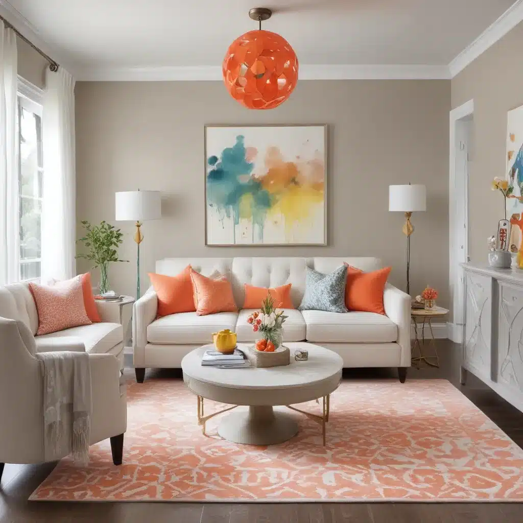
Embracing the Power of Monochrome with a Twist
I’ll never forget the day I first stepped into the pristine, white-walled showroom of ABC Home & Renovation in Aberdeen. As my eyes swept across the clean lines and minimalist furnishings, I was struck by the sheer elegance and sophistication of the space. But it wasn’t until I noticed the subtle pops of vibrant color – a plush turquoise throw, a vase of sunny yellow blooms, a glittering gold accent lamp – that the space truly came alive.
You see, I used to think that neutral palettes had to be boring. That to make a real design impact, you needed to go bold with your colors, layering on the hues like an artist with a palette knife. But this showroom proved me delightfully wrong. By masterfully weaving together muted tones and strategic splashes of vivid color, the designers had managed to create an interior that was simultaneously serene and show-stopping.
The Art of Monochromatic Mastery
As I later learned, this design approach is known as a “monochromatic color scheme” – and it’s quickly becoming a favorite among interior designers and homeowners alike. The concept is deceptively simple: you start with a single neutral shade, then build out your palette by incorporating various tints, tones, and shades of that core color.
According to design expert Cathy Hobbs, this approach can be “luxurious and elegant” while also serving as the perfect foundation for pops of color and metallic accents. And as I wandered through the ABC showroom, I could see exactly what she meant. The crisp white walls and soft, dove-gray upholstery provided a tranquil backdrop, allowing the vibrant turquoise, sunshine yellow, and shimmering gold elements to really shine.
Finding the Right Neutral Foundation
Of course, choosing that foundational neutral is key. As the experts at Edward George London point out, white is one of the most versatile options, with a myriad of cool and warm shades to choose from. But gray and brown can also make excellent starting points, depending on the overall aesthetic you’re aiming for.
For the ABC showroom, the designers had opted for a mix of soft, creamy whites and weathered grays – a palette that evoked a sense of casual elegance and beachy tranquility. And as I ran my fingers along the driftwood-inspired coffee table, I could practically feel the gentle coastal breezes wafting through the space.
Bringing in the Pops
Of course, a monochromatic scheme doesn’t have to be all neutrals, all the time. In fact, the design gurus at The Seattle Times note that pops of color can help “enliven and uplift” a neutral-based palette. And that’s exactly what the ABC team had done so masterfully.
Throughout the showroom, I spotted vibrant accents that seemed to dance across the muted backdrop – a turquoise vase overflowing with lush greenery, a sunny yellow throw pillow, a glittering gold table lamp. These bold, punchy hues didn’t overwhelm the space, but rather infused it with an undeniable sense of energy and verve.
Layering in Texture and Contrast
But the designers hadn’t stopped there. They’d also incorporated a range of materials, textures, and finishes to add even more visual interest to the monochromatic scheme. Sleek, glossy lacquered surfaces gave way to the rustic, weathered charm of driftwood and woven rattan. Plush, velvet-upholstered seating contrasted with the cool, smooth planes of marble and stone.
And as I ran my hands over the various surfaces, I was struck by the sheer depth and complexity of the space. It wasn’t just a simple black-and-white palette – it was a symphony of subtlety and sophistication, where every element worked in perfect harmony to create a truly captivating whole.
Bringing it Home
As I reluctantly tore myself away from the ABC showroom, I couldn’t help but feel inspired. This was a space that had shattered all of my preconceptions about neutral design, proving that a monochromatic palette could be anything but boring. With the right mix of muted tones, strategic pops of color, and carefully curated textures, it was possible to create an interior that was both visually striking and deeply soothing.
And you better believe I’m already dreaming up ways to bring that same magic into my own home. After all, as the team at GIS StackExchange so eloquently put it, the key is finding that perfect balance – where the neutral foundation whispers “relaxed waterfront living,” and the vibrant accents sing out in joyful harmony. Now, excuse me while I go start rearranging my throw pillows…


