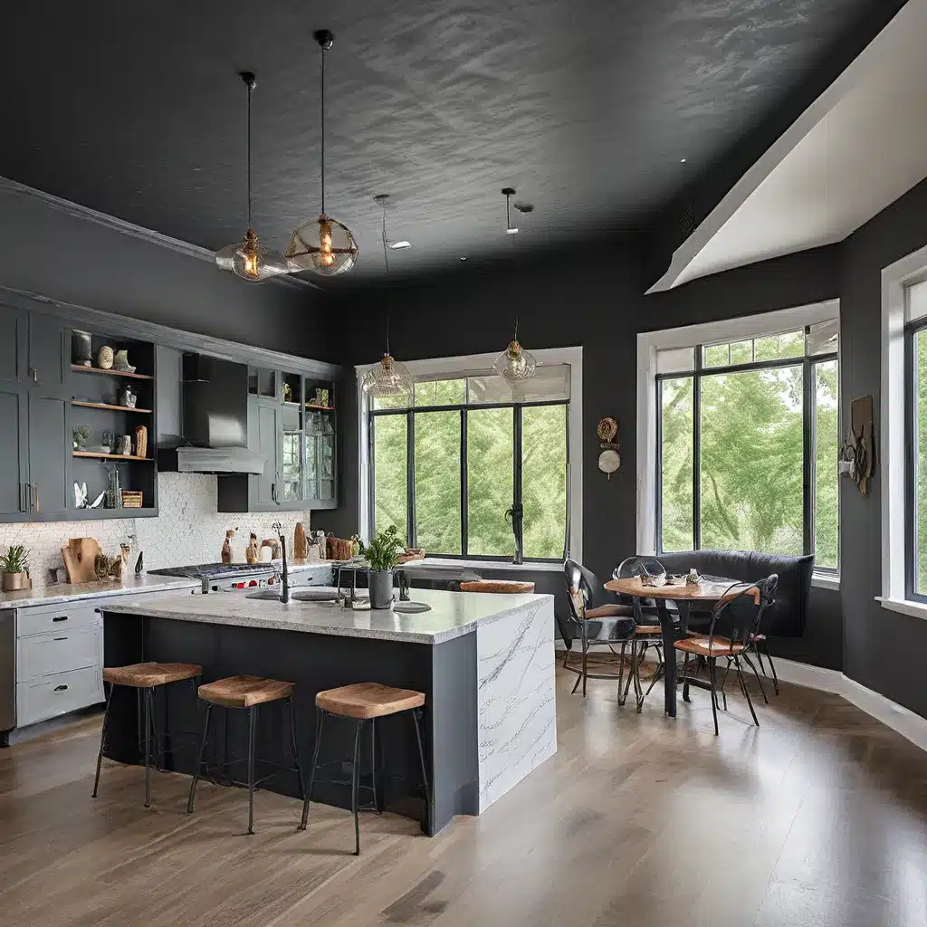
As someone who’s been in the throes of a home renovation for what feels like an eternity, I know all too well the challenges and joys that come with transforming your living space. And let me tell you, the latest trend I’ve stumbled upon has got me giddy with excitement. It’s called the Unexpected Red Theory, and it’s about to turn my lackluster kitchen into a veritable showstopper.
Uncovering the Unexpected Red Theory
Now, I’ll admit, the thought of decorating with red can be a tad daunting. It’s a bold, energetic color that’s often associated with danger, anger, and passion. But according to the TikTok interior design experts, there’s a way to harness the power of red in a surprisingly subtle and sophisticated way.
The Unexpected Red Theory, as coined by creator Taylor Simon, is all about adding a touch of red to a room where it seemingly doesn’t belong. It’s like a color pop, but with a twist. And the best part? It actually works!
As Taylor explains, “It’s taking something mundane and giving it a rather surprising lick of red to really uplift that piece in a way that gives you a good dose of dopamine.” In other words, you’re taking the unexpected and turning it into something truly remarkable.
Painting the Town (Farrow & Ball) Red
Now, I’m not one to typically gravitate towards bold hues, but this TikTok trend has got me rethinking my color palette. And with the help of some expert advice, I’m confident I can pull off this look in my own home.
Farrow & Ball has been my go-to for paint colors, and their rich, earthy reds are the perfect canvas for this unexpected trend. I’ve been eyeing their Etruscan Red – a deep, browned-based hue that I think will complement the terracotta tiles in my kitchen beautifully. But I’m also seriously considering Baked Cherry from Little Greene, or even Brick Red from Benjamin Moore.
According to Tiffany Duggan, interior designer and founder of Studio Duggan, “Blue and red will never get old in a scheme.” And she’s got a point – the contrast between those complementary colors is simply stunning. Plus, Hebe Hatton, Head of Interiors at Homes & Gardens, explains that “Complementary colors are all about contrast” and that “greens and blues paired with red” can really ground the overall scheme.
Mastering the Art of Moderation
Now, I know what you’re thinking – “But won’t a bold red just be too much?” And that’s a fair concern. After all, we don’t want our homes to look like they’ve been hit by a Crimson Tide. But according to the experts, the key lies in moderation.
Victoria Barker, founder of interior design firm Studio Faeger, recommends using “more muddy, earthy reds” which “takes the electric shine out of them.” And William Eaves, design and development Director at British Standard Cupboards, suggests opting for “warmer, richer tones” like “maroons, burgundy, and wine shades” if you’re nervous about going all-in on red.
The trick, it seems, is to use red as an accent rather than a statement. A pop of red in the form of a lamp, a piece of artwork, or even a painted window trim can instantly breathe new life into a space without overpowering the room.
Embracing the Unexpected in My Own Renovation
As for my kitchen renovation, I’m so excited to put this Unexpected Red Theory into practice. I’ve already got my tester pots lined up, and I’m eager to see how a touch of red can transform my otherwise neutral space.
Imagine a deep, burgundy-tinged red casually draped across my kitchen cabinets, or a vibrant Etruscan Red framing the window overlooking my backyard. It’s going to be a game-changer, I just know it.
And the best part? This trend isn’t just a passing fad. As the experts at ABC Home have pointed out, red is here to stay. In fact, it’s expected to be the color of 2024, dominating both our wardrobes and our interiors.
So, if you’re like me and you’ve been playing it safe with your color choices, I encourage you to embrace the unexpected. Take a risk, add a touch of red, and watch as your space transforms into something truly magnificent. After all, what’s the worst that could happen? A little color-induced dopamine never hurt anyone, right?


