Breathing Life into Monotone Interiors
Ah, the eternal dilemma – how does one infuse a space with personality, without compromising the soothing, serene vibe of a neutral color scheme? As the owner of ABC Home Renovation in Aberdeen, UK, I’ve seen it all. From clients who crave a calming, minimalist aesthetic, to those who long to surround themselves with a vibrant kaleidoscope of hues. And you know what? I’ve developed a few tricks up my sleeve to reconcile these seemingly contradictory design goals.
You see, I firmly believe that a neutral foundation doesn’t have to mean boring. In fact, it can act as the perfect blank canvas to unleash your creative flair. The key is finding the right balance – strategically placing pops of color to breathe life into the space, while still maintaining an overall sense of harmony and cohesion. It’s a delicate dance, to be sure, but one that can yield truly stunning results.
Let me share a recent project that perfectly encapsulates this principle. A young professional client of ours, let’s call her Sarah, had just purchased a charming flat in the heart of Aberdeen. She loved the clean lines and airy feel of the space, but lamented that it felt a bit… well, lifeless. That’s where we came in.
Mastering the Art of Contrast
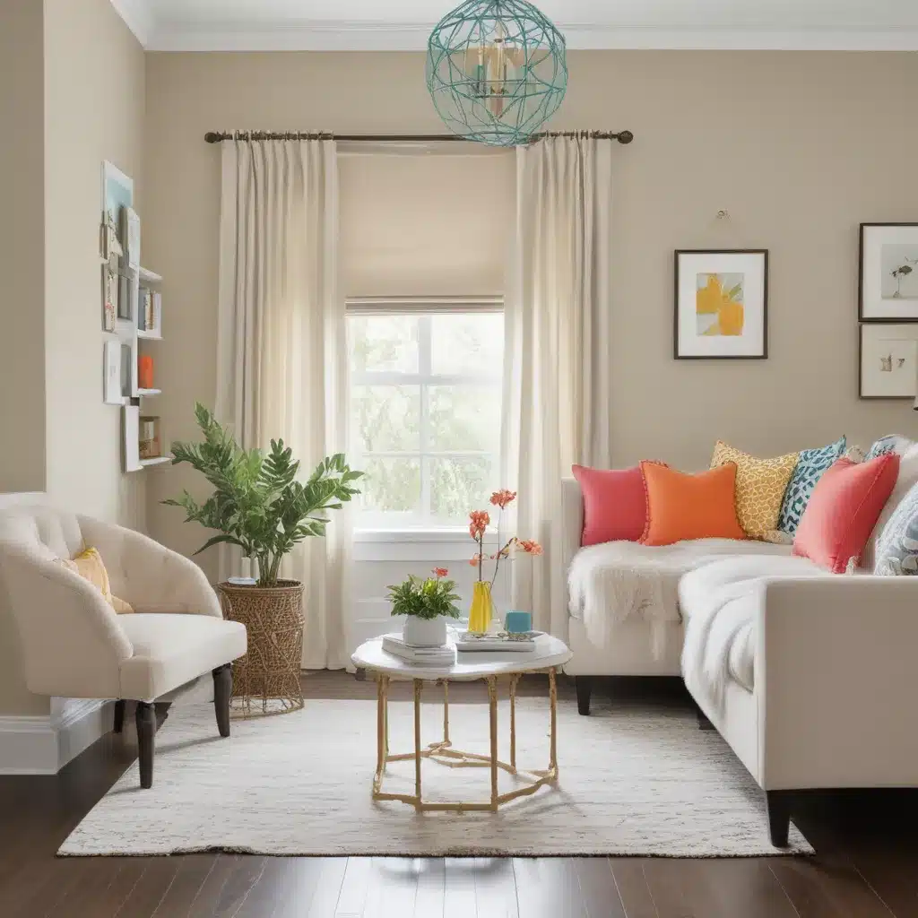
Sarah’s vision was to create a serene, soothing retreat – but with just enough visual interest to keep things feeling vibrant and alive. We started by establishing a neutral foundation – think soft, earthy tones like warm beiges, muted grays, and rich browns. These hues formed the backbone of the design, providing a sense of calm and stability.
But then came the fun part – the pops of color! We carefully selected a few key accent pieces that would instantly liven up the space. A plush, jewel-toned velvet sofa in a rich, moody teal. Vibrant throw pillows in shades of mustard, coral, and emerald. A striking abstract painting in a symphony of blues and greens, commanding attention as the focal point of the living room.
The result? Sheer design magic. The neutral backdrops allowed these bold, colorful accents to truly shine, creating a masterful interplay of light and dark, warm and cool. The space felt cohesive and harmonious, yet far from boring – each element working in perfect harmony to craft a visually stunning, yet supremely livable, aesthetic.
Finding the Right Balance
Of course, the key to pulling off this look lies in finding the right balance. Too much color, and the space can feel overwhelming and chaotic. Too little, and you risk falling back into that dreaded realm of monotony. It’s a delicate dance, to be sure, but with a keen eye and a bit of creativity, the possibilities are endless.
One of my favorite tricks is to start with a neutral foundation, then strategically introduce pops of color through easily swappable accents. Throw pillows, area rugs, artwork, and decorative accessories are all fair game. This allows you to effortlessly refresh and revitalize the space, without having to commit to a complete overhaul.
And let’s not forget about the power of texture and materials. Pairing sleek, modern finishes with warm, organic elements can instantly infuse a space with visual interest. Imagine a minimalist, white-washed wood console table, topped with a vibrant ceramic vase and a stack of coffee table books in jewel-toned covers. Or a crisp, dove-gray sofa punctuated by a sumptuous velvet armchair in a rich, royal blue.
The possibilities are endless, my friends. The key is to have fun, experiment, and trust your instincts. After all, the beauty of design lies in its ability to reflect your unique personality and style. So don’t be afraid to take risks, to push the boundaries, and to create something truly extraordinary.
Embracing the Unexpected
Now, I know what you might be thinking – “But won’t all those bold, colorful accents clash with my neutral foundation?” And to that, I say – embrace the unexpected! Some of the most stunning design moments come from juxtapositions that, on paper, might seem unlikely to work.
Take, for example, the pairing of a sleek, minimalist kitchen with vibrant, patterned bar stools. Or a serene, gray-and-white bedroom punctuated by a vibrant, abstract artwork. These are the kinds of design choices that make people stop in their tracks, captivated by the sheer audacity and artistry of the space.
Of course, it’s all about striking the right balance. You don’t want to create a visual cacophony that leaves your guests feeling overwhelmed and disoriented. But with a bit of careful curation and a keen eye for proportion, you can craft a space that feels simultaneously cohesive and dynamic, soothing and invigorating.
Bringing it All Together
And that, my friends, is the true art of infusing neutral schemes with pops of color. It’s about finding the perfect equilibrium, striking a harmonious balance between the calming and the captivating. It’s about unleashing your creativity, embracing the unexpected, and above all, having fun with the design process.
So, if you’re ready to breathe new life into your neutral palette, I say – go for it! Experiment with bold hues, play with texture and materials, and let your personality shine through. The possibilities are endless, and the rewards are oh-so-sweet.
And if you need a little help along the way, don’t hesitate to reach out to the team at ABC Home Renovation. We’re here to guide you through the process, offering our expertise and creative vision to help you transform your space into something truly extraordinary. Visit our website to learn more about our services and get started on your next project.


