Breathing New Life Into Your Home
As a proud homeowner in Aberdeen, I know all too well the challenges of keeping our living spaces feeling fresh and vibrant. Over the years, those once-invigorating rooms can start to feel a bit lifeless, don’t they? The walls that once inspired us now seem dull and uninspiring. But fear not, my fellow Aberdonians, for I have uncovered a secret weapon in the war against tired decor: the power of paint colour pairings.
ABC Home, the trusted renovation experts in our city, have shared their top tips for using paint to completely transform the look and feel of any room. And I’m here to pass those insights on to you, along with a few personal anecdotes and a healthy dose of humor to keep things entertaining. So, grab your paintbrushes and get ready to breathe new life into your living spaces!
Choosing the Perfect Palette
When it comes to revitalizing a tired room, the key is to find the right colour combination. Now, I know what you’re thinking – “But Samantha, I’m no interior design expert!” – and that’s exactly why I’m here to help.
Let’s start with the foundation: the wall colour. According to the design gurus at ABC Home, the secret to a show-stopping palette lies in finding the perfect neutral. Now, I know what you’re picturing – boring beige or drab gray. But trust me, there’s so much more to neutral tones than meets the eye.
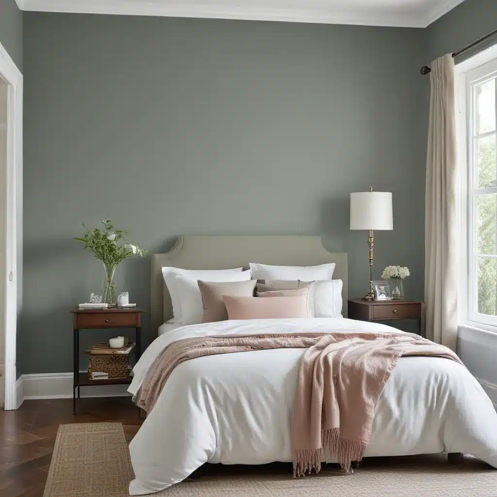
One of my personal favorites is Benjamin Moore’s “Revere Pewter.” It’s a beautiful, soft gray with just a hint of warmth that instantly adds a touch of elegance to any space. And when you pair it with crisp white trim and accents, it creates a timeless, sophisticated look that’s anything but boring.
Another top pick from the ABC Home team is Benjamin Moore’s “Simply White.” Now, I know what you’re thinking – “But Samantha, won’t that make the room feel too sterile?” Not to worry, my friends. When you layer in pops of natural wood tones and cozy textiles, that pristine white transforms into a serene, calming oasis.
Bringing in the Wow Factor
Alright, so we’ve got our neutral foundation sorted. But as any interior design aficionado will tell you, the true magic happens when you start to layer in those eye-catching accent colours. And trust me, the team at ABC Home has some real showstoppers up their sleeve.
One of my personal favorites is a bold, moody blue. Now, before you start picturing something straight out of a nautical-themed nursery, hear me out. When you pair a rich, inky blue (think Farrow & Ball’s “Hague Blue”) with crisp white trim and natural wood accents, the result is nothing short of spectacular. It’s sophisticated, it’s chic, and it’ll have your guests wondering if you hired a professional designer.
Another paint colour pairing that’s been stealing the spotlight lately is a timeless combo of sage green and creamy white. Now, I know what you’re thinking – “Sage green? Isn’t that a bit, well, grandma-ish?” – but trust me, the team at ABC Home has cracked the code. When you pair a soft, muted sage green (like Behr’s “Peaceful Valley”) with pristine white walls and accents, the result is a serene, spa-like oasis that’s anything but dated.
Putting it All Together
Alright, so we’ve covered the foundation (neutral wall colours) and the wow factor (show-stopping accent shades). But as any seasoned DIYer will tell you, the real magic happens when you start to layer in those finishing touches.
One of my personal secrets for creating a truly show-stopping space? Incorporating natural elements like reclaimed wood, woven textures, and lush greenery. It’s amazing how just a few well-placed accents can transform a tired room into a Pinterest-worthy oasis.
Take, for example, my kitchen renovation project. I started with a foundation of crisp, white cabinets and Benjamin Moore’s “Revere Pewter” on the walls. But to add that extra punch of personality, I incorporated warm, natural wood tones in the form of a rustic butcher block island and pendant lights with a farmhouse-chic vibe. And to bring in that much-needed touch of life, I added a few lush, trailing plants to really make the space feel like a true oasis.
The team at ABC Home has been instrumental in guiding me through every step of the process, from selecting the perfect paint colours to sourcing the ideal accent pieces. And let me tell you, the transformation has been nothing short of jaw-dropping.
So, what are you waiting for, fellow Aberdonians? It’s time to breathe new life into those tired rooms and create a space that truly reflects your personal style. With the help of ABC Home and a few strategic paint colour pairings, the possibilities are truly endless.


